The meaning of colors in marketing
Author: Iris van der Heijden
Author: Iris van der Heijden
For centuries we have been intrigued by colors and their meaning. For example, numerous articles have been written about our strong preference for brands where the color matches the brand promise and research shows that our brains interpret and process colors in different ways. For example, the emotional and psychological impact of colors on people can differ greatly; brands can use this knowledge to their advantage. The color red is a good example of this. This color is often used to encourage people to act or to add more emotion and urgency to a message. Where red therefore demands attention and makes people alert, the color blue with its calm and businesslike appearance is the opposite.
Because of all these different associations with colors, it is worth making a conscious choice when it comes to choosing a color, or multiple colors, for your brand. What message do you want to communicate with color to customers?
Navigate quickly to the color meanings: blue, red, yellow, purple, orange, pink, green, brown, black, gray, white.
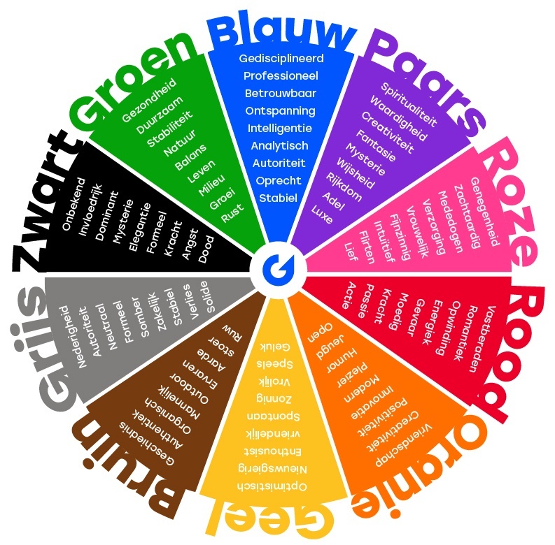
Psychologie van kleuren: de symbolische betekenis van kleuren in marketing in een notendop
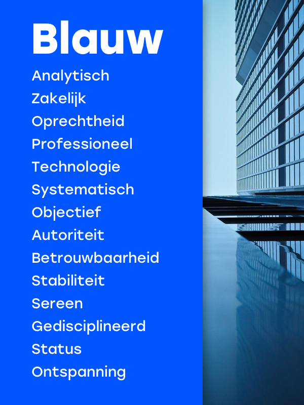
As we mentioned in the intro, the color blue is an excellent color if you want to appear serious, businesslike and professional. Blue radiates trust, honesty and reliability. This color thus contributes to building customer loyalty. The professionalism that is often associated with blue is because it is an objective, calm and analytical color. That is why you see that this color is often used by companies and brands that want to emphasize their systematic qualities.
Which brands use the color blue in their marketing?
Blue stands for reliability and professionalism. This is important for companies that work in the financial or insurance sector. The Consumentenbond and OHRA are a few examples of this. The Police also belong in the list of "brands" that use the color blue. They mainly use blue to radiate authority and to show that they work in a disciplined, objective and systematic way. Another interesting branch that uses the color blue in its brands and corporate identities is social media companies such as Skype, Twitter, LinkedIn and last but not least, Facebook. They choose the color blue to radiate confidence and reliability. The reason for this is that brands like this deal with the confidential and especially personal information of billions of people every day. They therefore want to create the confidence that they do this in a safe and reliable way. However, in practice, some of these companies show that there is still a difference between what they radiate and what they actually do. ;)
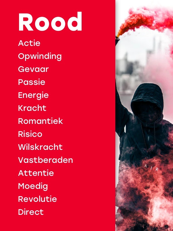
To begin with, red is a warm and positive color. A color that draws the attention of consumers and calls for action. Red is associated with energy, excitement, willpower, courage and determination. The color, however, also carries a whole different charge, because which color do you automatically link to words such as passion, love and romance? Right, red. For example, women wearing red clothes are often found more attractive than women wearing a different color and with Valentine's Day we see gifts wrapped in red or cards with red hearts on them.
Which brands use the color red in their marketing?
Because red is such a powerful, almost predominant color, it goes well with passionate and Italian brands such as Alfa Romeo and Ferrari. These brands that have a powerful or revolutionary belief system also want to convey this to the consumer. For example, the Jupiler beer brand is also a good example of a brand that uses red in its logo to add strength. The bull in the Jupiler logo is of course an expression of strength and energy in itself, but this is also enhanced by the color red. You definitely get strength from that! Red brands such as Kruidvat or H&M use red to symbolize high discounts and cheap prices. Another brand that should not be forgotten in this list, especially because they have deliberately chosen this color, is Coca-Cola. The brand has been known for its red logo for decades. One of the reasons why Coca-Cola has chosen this color in its logo is because the color red stimulates the appetite (and therefore also thirst), smart move Coca Cola!
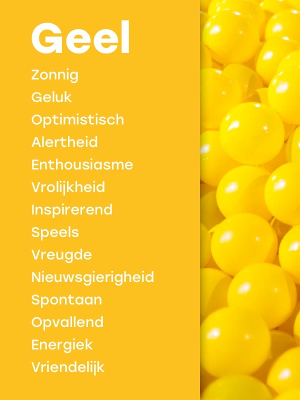
If you want to convey the feeling of playfulness and cheerfulness with your brand, then choose the color yellow. Yellow contains the most light of all colors and is associated with the sun and spring flowers. It is therefore not surprising that we spontaneously become optimistic when we encounter this color on the street. This color is also called the color of happiness and radiates energy. It is precisely for this reason that brands use this color when they want to express spontaneity.
Which brands use the color yellow in their marketing?
Happiness, playful, cheerful. Yellow is a color most commonly used by entertainment brands. Think of Intertoys, Chupa Chups and of course McDonalds, which can be recognized from miles away by the big yellow "M" along the highways. The color yellow is also indispensable at supermarket group Jumbo. They think it is important that people enjoy shopping at the yellow giant. In addition, the friendly slogan "Hello Jumbo!" Also rhymes perfectly with the meaning of the color yellow. In addition to Jumbo, Snapchat is also embracing the color yellow with open arms. Yellow in combination with the ghost of Snapchat gives the brand a very playful effect. Because Snapchat uses the color yellow in their corporate identity, they reinforce their brand promise and in general yellow communicates what Snapchat is about: having fun together.
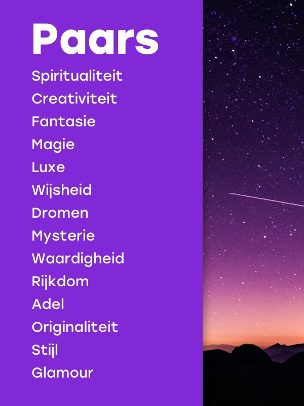
Purple is a combination of the calm blue and the powerful of the color red. Purple used to be one of the most difficult colors to make and obtain. For that reason, the color purple was also priceless for "the common people" and only noble people could use this color for their clothing and fabrics. Today, the purple color is therefore still linked to royal. With purple you radiate richness and glamor. Another meaning that people often attribute to the color purple is spirituality, wisdom and magic. A nice example of this is the 1959 film "Sleeping Beauty" from Walt Disney. Here you can see that both the palace where Aurora lives is shrouded in purple to radiate nobility but also the evil witch's cloak lined with the purple fabric that eventually casts a magical spell to put Aurora to sleep.
Which brands use the color purple in their marketing?
Well-known brands that use the "luxury" color purple in their logo and / or corporate identity are not coincidentally a gift brand such as Hallmark and the "premium" cat food Whiskas. Hallmark uses this color in combination with the logo (a crown) to radiate luxury and Whiskas is known for its high-end cat food. After all, you want the best for your cat, right? Another brand with a purple logo is Fontys, the largest university of applied sciences. The purple color in the logo here represents wisdom and knowledge. For example, Fontys has the well-known slogan 'Think Bigger' in which they think 'out of the box', which means purple. Not only does the brand stop there, they organize an annual Fontys Purple festival for students. Purple is really an extension of the brand message here.
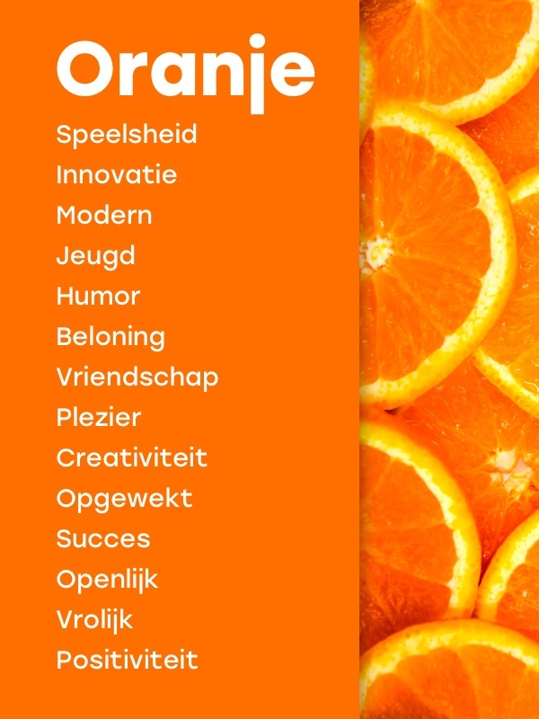
The color orange is, just like purple, a combination of colors and lies in the spectrum between the powerful red and cheerful yellow. The color orange is often associated with cheerfulness, warmth, energy and friendship. Tiger, the character from Winnie the Pooh, is the perfect translation of the color orange, just like the fox from the movie Frank and Frey who likes to make friends.
Which brands use the color orange in their marketing?
We Dutch are strongly associated with the orange color through our royal family. It is therefore not surprising that Dutch companies such as PostNL, Rabobank and the Royal Air Force want to emphasize their identity by using orange in their logos. In Winnie the Pooh, Tiger, who is constantly jumping around, radiates enthusiasm and energy. The energetic vibe that people get from the color orange is also exploited by the well-known children's television network Nickelodeon. The flamboyant and vibrancy of the color orange is a natural choice for brands that want to express their self-confidence, enthusiasm and optimistic energy, such as Fanta.
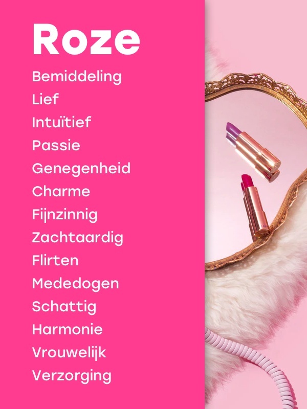
Pink is a delicate color and can be described as red's "sweet" little sister. Both colors represent love and passion, but where the color red represents the aggressive in these two, the color pink represents the soft side of love. Think romance, innocent flirting and charm. For this reason, pink is often used as the color of universal love, both "self-love" and love for others. If you want to put more emphasis on the innocent side of your brand, it is better to choose a light pink color and if you want to add more power or passion, go for a darker version.
Which brands use the color pink in their marketing?
Incredibly stereotypical - we know - but still contemporary: when brands want to appeal to a female target group, they use the color pink. Just look at brands such as Barbie, ICI Paris XL and Victoria's Secret. All three have women and girls as their main target group, which is why the pink color is chosen as the basic color in all commercial communications. T-Mobile is also a brand that uses the properties of the color pink. Thus, the brand is one of the world's leading mobile communications companies. Adding the bright pink hue to their identity makes the brand appear passionate.
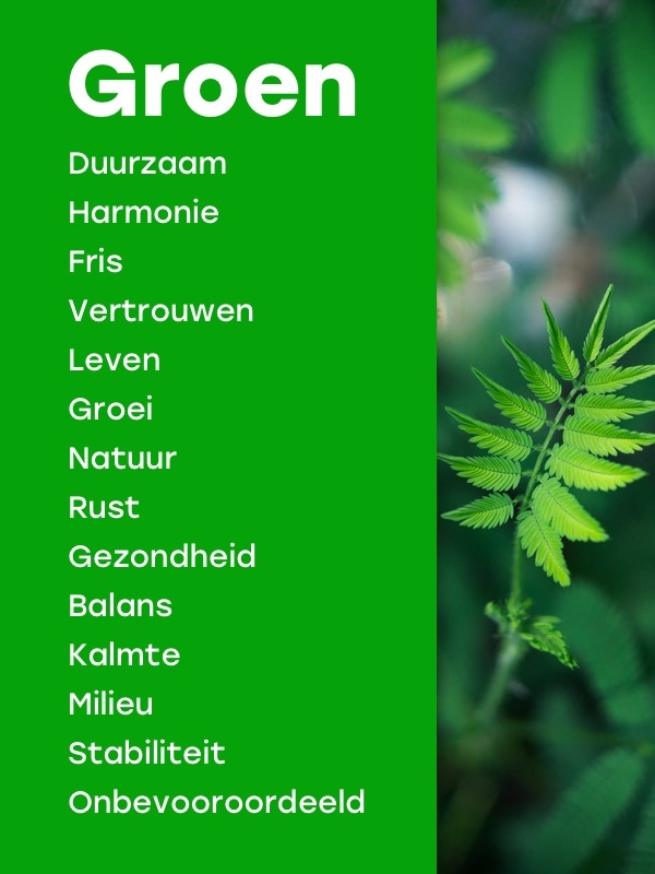
Balance, harmony and growth: that is what the color green stands for. When we think of matters such as sustainability, the environment, health and nature, we quickly arrive at the color green. It is therefore an obvious choice to use green when you want to promote green and environmentally friendly products. The color has a calming effect on people and green provides peace, stability and confidence. With such powerful and calming properties the color green has on humans, this color is even said to have healing powers. Interesting to see which brands use this color for their brand message.
Which brands use the color green in their marketing?
Green is a color associated with flora. That is why we see that this color is often used at companies such as garden centers, gardeners, nature reserves and zoos such as Blijdorp. Greenery also suits caring professions where a calming environment is important. Think of hospitals, wellness centers and therapists. Just like blue, green is also a popular color for health insurance, just look at VGZ, DSW and the IZA who all want to radiate stability and confidence with the color. But McDonalds with their familiar yellow and cheerful "M" has also made an attempt to use the color green to create an environmentally friendly and healthier image throughout Europe. For example, all restaurants have been transformed into green and you will no longer encounter red in any communication. However, it seems that the Americans are not ready for a corporate identity change ...
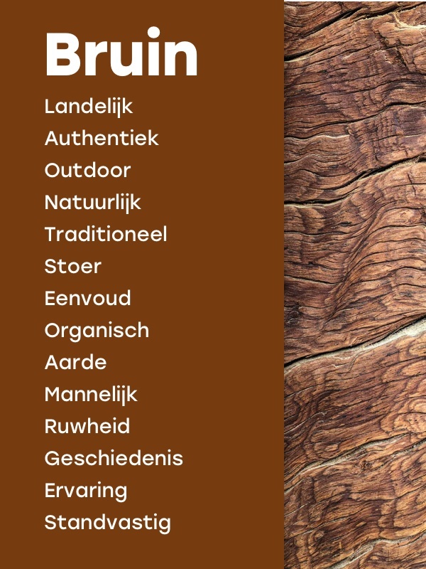
Brown is the color of the earth, of soils and of organic. As a result, we associate concepts such as roughness, rural and unprocessed with the color brown. This roughness ensures that brown has a masculine and tough look. Brown is also a good choice for brands that stand for steadfastness, tradition and experience, as brown evokes a sense of history. This symbolic meaning ensures that brown is often used when we want to give the "back to the roots" feeling to the consumer. Where yellow is associated with spring, brown is a color typical of autumn, a color that matches the feeling of sitting in front of the wood stove together. The color brown creates a warm, authentic, refined and traditional atmosphere.
Which brands use the color brown in their marketing?
We see brown in various sectors. For example, the color is used by food and drink suppliers such as chocolate manufacturer Dove and M & M's, or the coffee maker Nespresso. Nespresso uses the color brown to enhance their refined and home-made coffee. The color brown is also often used in craft professions such as making furniture. By using this color within this sector, you emphasize the "authentic" and traditional feeling that consumers often look for when they want to have furniture made. In addition to the perhaps obvious sectors and professions that use the color brown in their logo and / or corporate identity, there is another well-known brand that uses this. United Parcel Service (UPS) has been known for decades for their brown logo, vans and uniforms. The reason for UPS to incorporate brown in their logo and corporate identity is that they want to emphasize experience, tradition and steadfastness, in other words, reliability. All concepts that match the color brown.
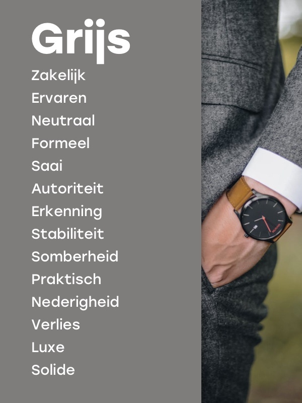
In color psychology, the color gray stands for neutrality. This meaning may be due to the fact that gray acts as a shadow between white and black. This color is often associated with dullness, gloom or inconspicuousness. Ever heard of the phrase "gray mouse"? Although gray sometimes brings negative emotions, the color is timeless and practical. The color gray is all about everything that is simple and minimalistic. In addition, gray hair is associated with the wise and older generations. As a result, the color gray also shows that you are experienced and professional.
Which brands use the color gray in their marketing?
When we talk about wisdom and experience, Wikipedia is a good example. They use gray as the color for their logo and brand, which is appropriate given Wikipedia is one of the best known online encyclopedias. Because gray is somewhat associated with technology and timelessness, brands such as Apple and Sony have also incorporated the color gray into their corporate identity and / or logo. For example, Apple also opts for gray because of its modern and minimalist image - which fits perfectly with their brand message, which is also completely focused on simplicity and minimalist design.
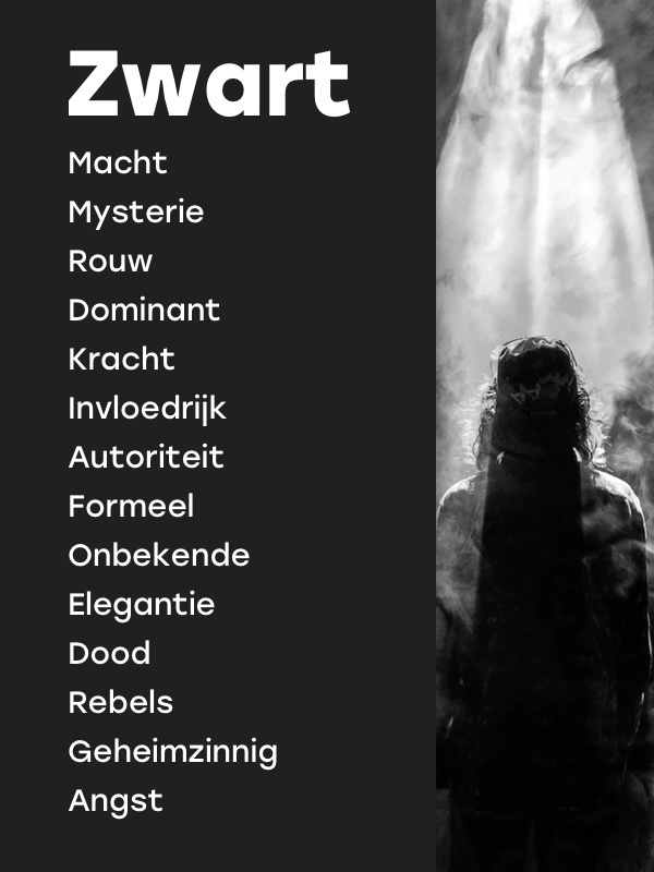
The color black refers to the mysterious, the unknown. The color black is used to create tension and mystery. From Western culture, the color black is often associated with death. This is because this color is almost always worn at funerals and the death symbol "Grim Reaper" is dressed in black. Although black is often associated with concepts such as grief, fear and loss, this color also represents strength and authority. The reason why referees wear black in many sports is because black is seen as a formal, elegant and prestigious color. That is why it is recommended to wear black for applications. With black you make a powerful impression from the first moment, but beware, it remains a difficult color to process in your brand or corporate identity due to all the negative associations.
Which brands use the color black in their marketing?
Brands that use the color black in their logo radiate authority. These are often brands that offer luxury products and / or services. For example, you see that large fashion houses such as Chanel, Dolce & Gabbana and perfume brand Jo Malone use these colors in their logo and marketing campaigns. For this reason, the luxurious look that black offers is also reflected in design hotels, interior shops or high-end perfumeries and cosmetic shops. By choosing the color black you make a statement because this color is strongly contrasted with all other colors of the spectrum. This not only makes you stand out, it also looks stylish!
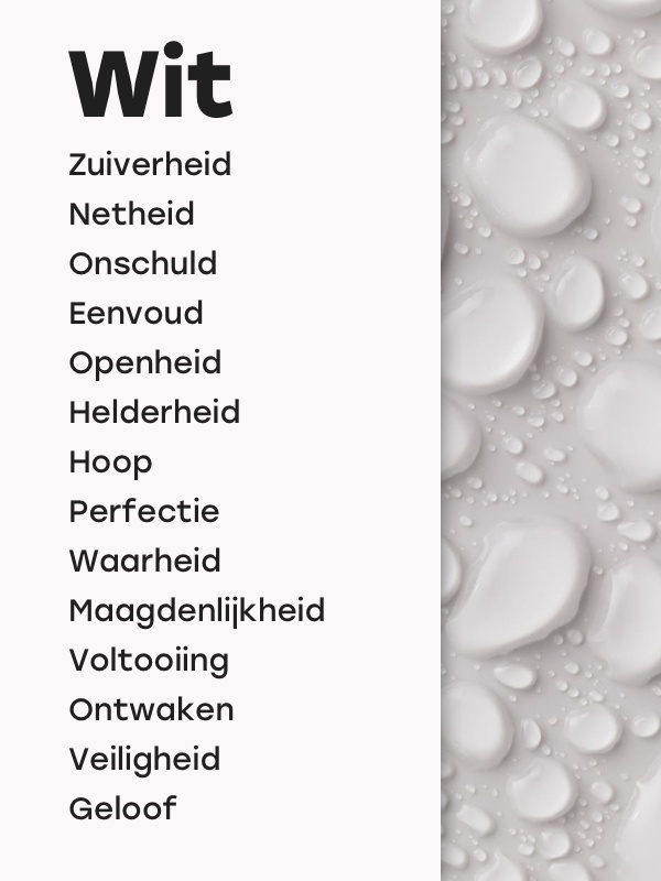
Last but not least! The last color on our list is white. We know that white, like black, cannot be considered an official color. Yet this non-color does have an effect on our behavior and emotions. That makes it worthwhile to include white in this list. White is associated with innocence, truth, purity or virginity. For that reason, doctors and nurses wear white clothes and brides wear white dresses when they get married. Traditionally, white has also been associated with religion, God, and all that is "holy." This is reflected in, for example, age-old paintings where holy persons are surrounded by a white light.
Which brands use the "color" white in their marketing?
There are very few brands that use white as the main color for their logo. However, the combination of black and white is often used. The reason for this is that this combination ensures that consumers focus on the "essence" of the product and / or brand. Brands that make use of this strong contrast are Wired and the World Wildlife Fund. You often see this color combination in brands and / or organizations that have implemented the essence, their 'why', in detail in the visual corporate identity. You also see many brands that use a white haze over certain colors, so that you get pastel colors, to come across a bit more innocenct than with the use of hard colors.
Colors tell a lot about a brand personality and the unique story they communicate to their audience. In fact, colors influence people's behavior and emotions, so that a first impression is often enough for a "make-it-or-break-it-moment". When a brand is recognizable, consistently and authentically positioned, you also see that people can more easily identify with the brand promise and message than when it concerns a "thirteen in a dozen" brand. By providing your brand with a clear brand promise, a powerful brand personality, and by streamlining all means of communication and communication (including color), your target group is fully included in the ultimate brand experience.
At Get Hooked, creating a unique positioning is central. We believe that positioning a brand - in which we research the unique motive of a brand in order to subsequently determine the right character, the right way of telling and thus the right color scheme - is the basis for fruitful, appropriate communication. A unique positioning and matching color combination makes the difference in any competitive market, allowing your brand to make the impact it deserves!
Make an impact with your brand too!
At Get Hooked, we like to contribute to an original and creative way to provide your brand with a good dose of impact and unique brand message. Are you ready to take a new step and make a difference? Send us an email or call us on 085 747 00 31 and we hope to see you soon!
